Tools
On this page we give you the tools to help you understand the epidemic. Currently this consists of the county level case predictions. Below that are our posts on data literacy.
Microcovid.org
I wanted to give this tool context by including a link to the following New York Times article.
https://www.nytimes.com/2020/08/28/opinion/coronavirus-schools-tradeoffs.html
Roughly this article makes the point that if you start taking risks in a new activity then you should reduce risks in your other activities. Just because you entered a pandemic pod, does not mean that now you should also start doing other activities. In fact quite the opposite, you should start limiting your contacts in other arenas.
Microcovid.org and how to use it.
Why it's not useful and dangerous- DO NOT treat this website and it's calculations as gospel. There is so much we don't know about this disease that it is impossible to make any website that generates probabilities of getting COVID-19 with accurate confidence levels. At best the probability numbers generated are in the right ballpark, at worst they might not be taking some critical factors into account that change the probabilities around. Furthermore a probability is a probability and even if the probability is small you might just get unlucky and get COVID-19.
Our crazy world- Now that I've given the caveats, I have to note that we are currently all stuck in a world in which we are making crazy decisions all the time. I am often asked for advice about whether I think a certain activity is a good idea. I also see people judging others without really knowing and grokking how risky the behavior is that they're complaining about.
Why Microcovid.org is useful.
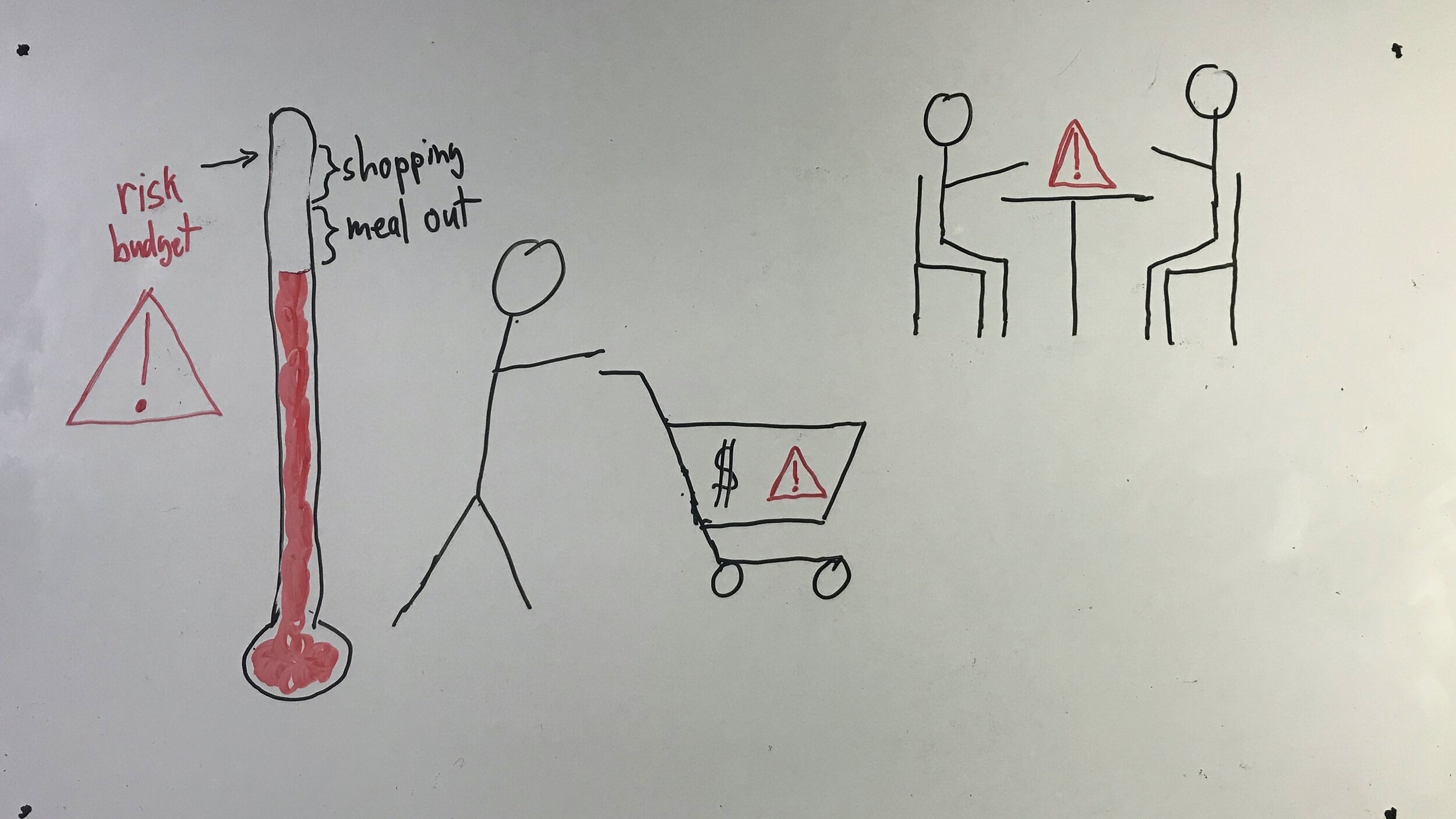
This tool allows humans who are poor at wrapping their minds around probabilities a way to develop a rough intuition about our crazy choices. One of the best ways I think of using this tool is to compare different activities to each other in a relative way. So for example you can see roughly how much more risky a plane flight might be than going 5 times to the grocery store. This could help you decide whether you should step on the plane or not.
Budgeting- I also like the idea of budgeting your microCovids as a way to bring some sanity and balance to our lives. We are all desperate for human contact and with this tool we have something that helps decide between a haircut versus socially distant dinner with a friend. Perhaps you could even do both if each activity is modified to reduce the risk of each enough.
Help you draw boundaries- I can see it also helping us stand up for ourselves and draw boundaries. I notice a tendency in myself and others, to step into a situation with the best intentions and then let my guard down and let my own and others protective behavior slide. For example I notice that at the start of an extended interaction with friends we start with good mask wearing and then the mask gets uncomfortable and comes down and it is awkward to ask someone to put their mask back on... This tool lets you think about the consequences of not wearing a mask. Not wearing a mask isn't necessarily dire, but it often helps make the activity just that much safer and knowing that might allow you to speak up for yourself and give you the tools to do so.
What questions do you have about microcovid.org? I would be really interested in what you think about the tool and how you use it (if you do.) Please send me any questions you might have about it and/or please cc me on any correspondence you might have with the creators of the tool. Please tell them I sent you. (I've already sent them some encouraging correspondence to microcovid to counter some naysayers that were circling this project.)

County new caseload comparison tool
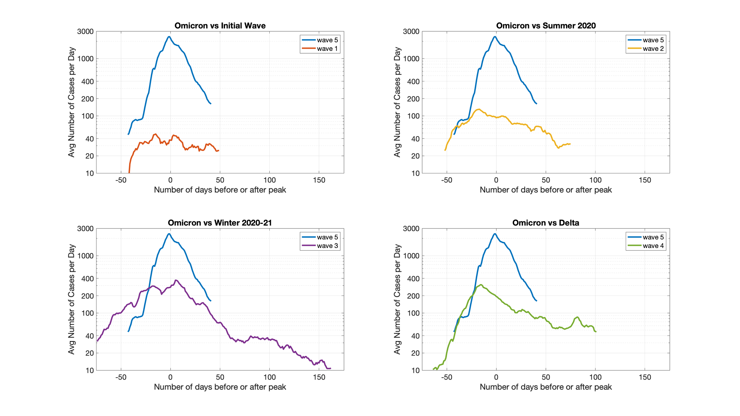
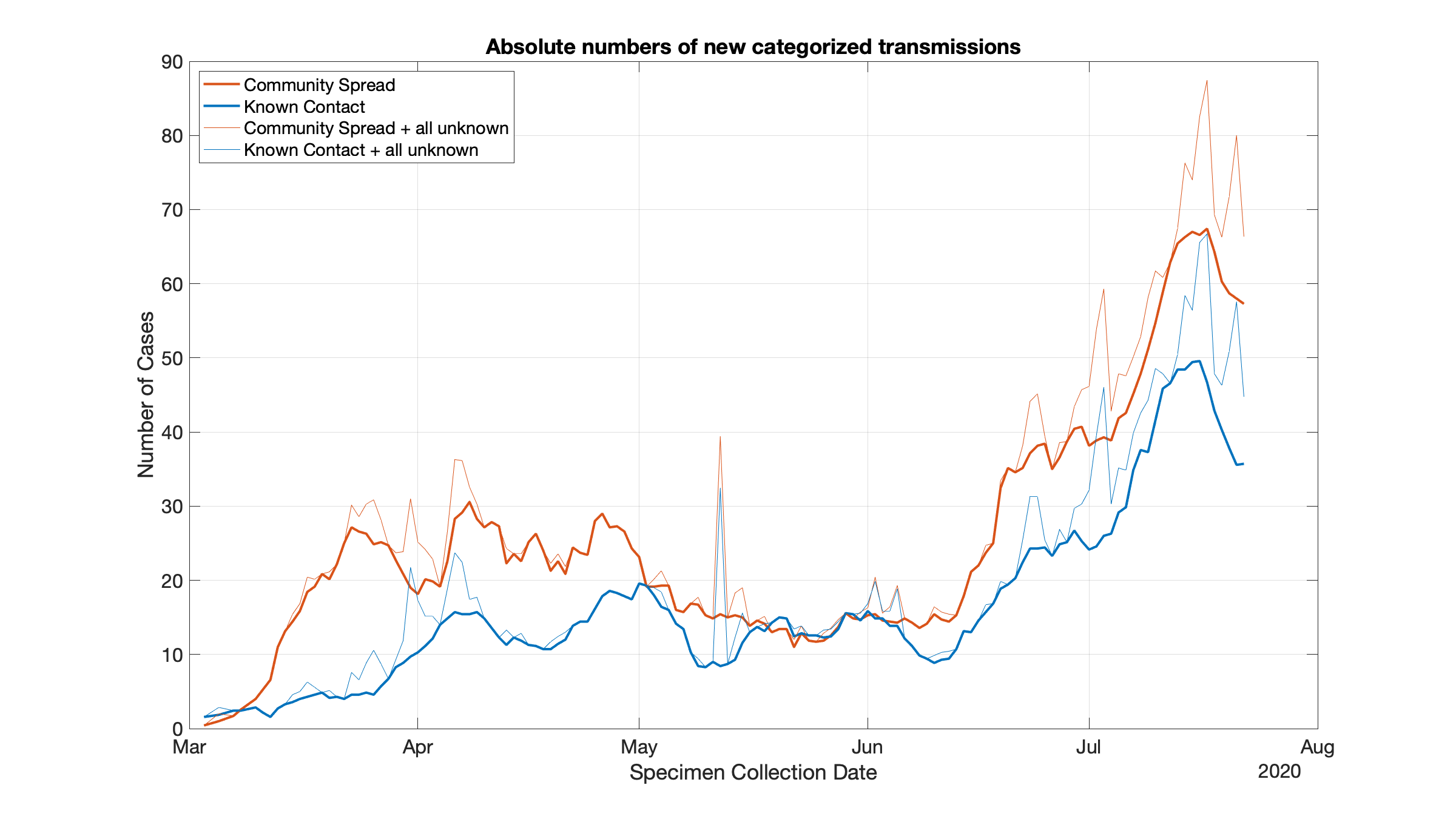
The tool I’m relying on most these days is located on our sister site. This allows you to pick two different counties in the US and compare their new incidence rate of COVID-19. I typically take any county I’m concerned about (say where a friend or relative lives) and compare it to New York City’s curve. I know that NYC got really bad and so I know when new incidence rates get up to the level of NYC in April things are going wrong.
Please allow a little time for the page to load as your browser is bringing in all the NY Times caseload data for the entire country. Once its loaded the interface is pretty snappy. Please note the user controls in the upper left corner, that is where you can change the counties selected and turn on an off 7 day averaging etc.
Please note that we have normalized the data by the counties population to draw a fair comparison between two regions.
County Level, Interactive, Animated, COVID-19 Case Load Tracking and Prediction.
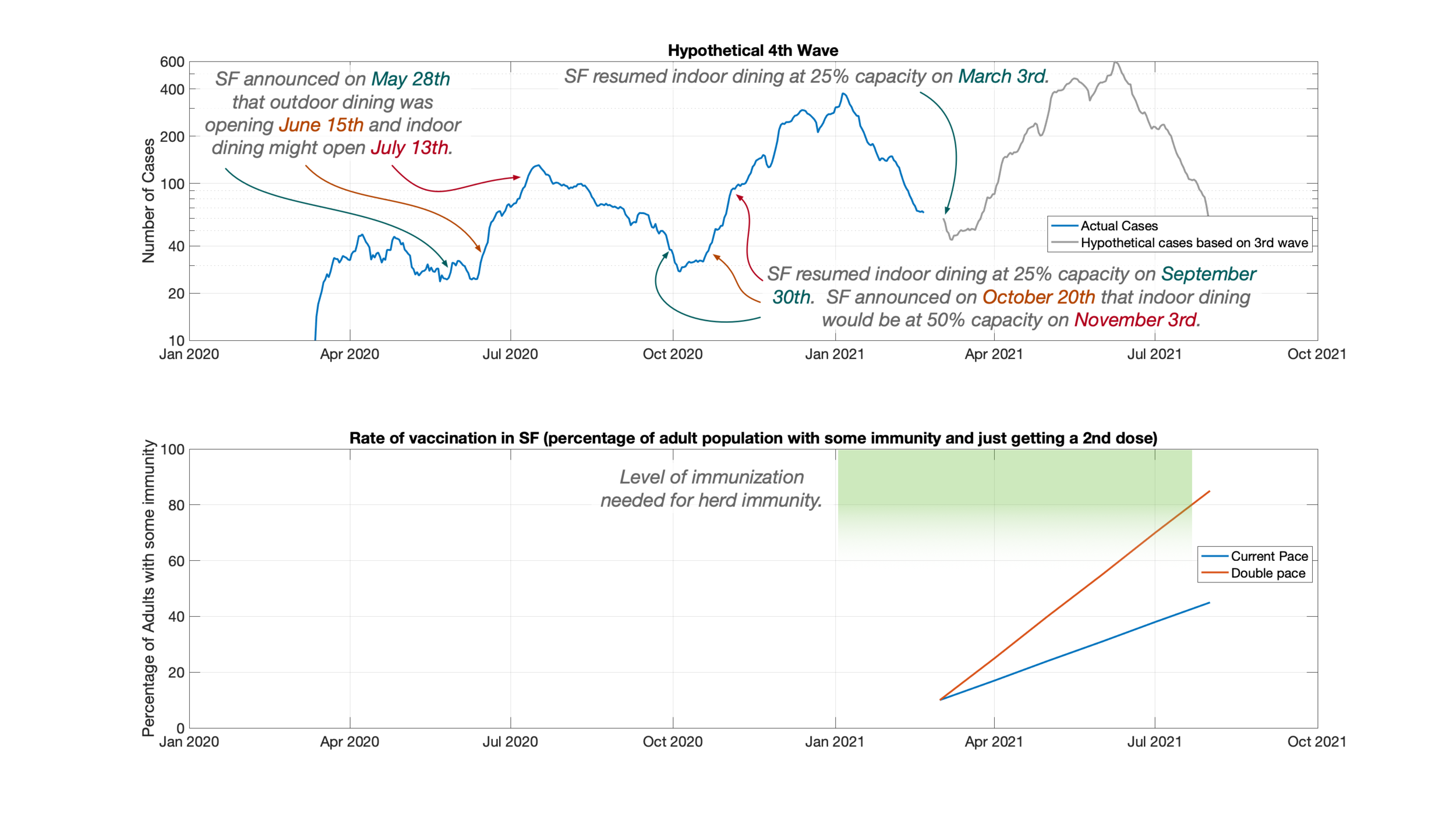
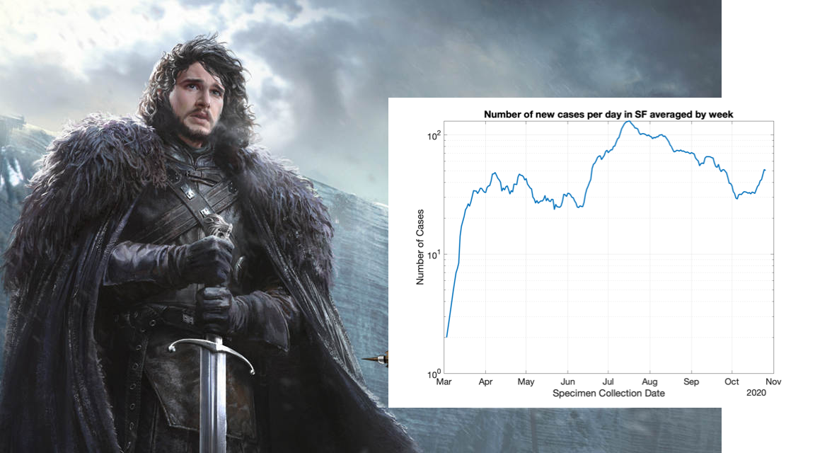
The tool linked in the button below is more useful in the next phase of the pandemic. It plots the number of new cases seen every day. This data is noisier and harder to draw a trend line through but it is easier and faster to spot an uptick in cases in this plot than our previous plot.
The tool linked in the button below plots cumulative case loads. This is most useful and interesting at the start of the epidemic. The data in this set is less noisy so it is easier to put trendlines through.
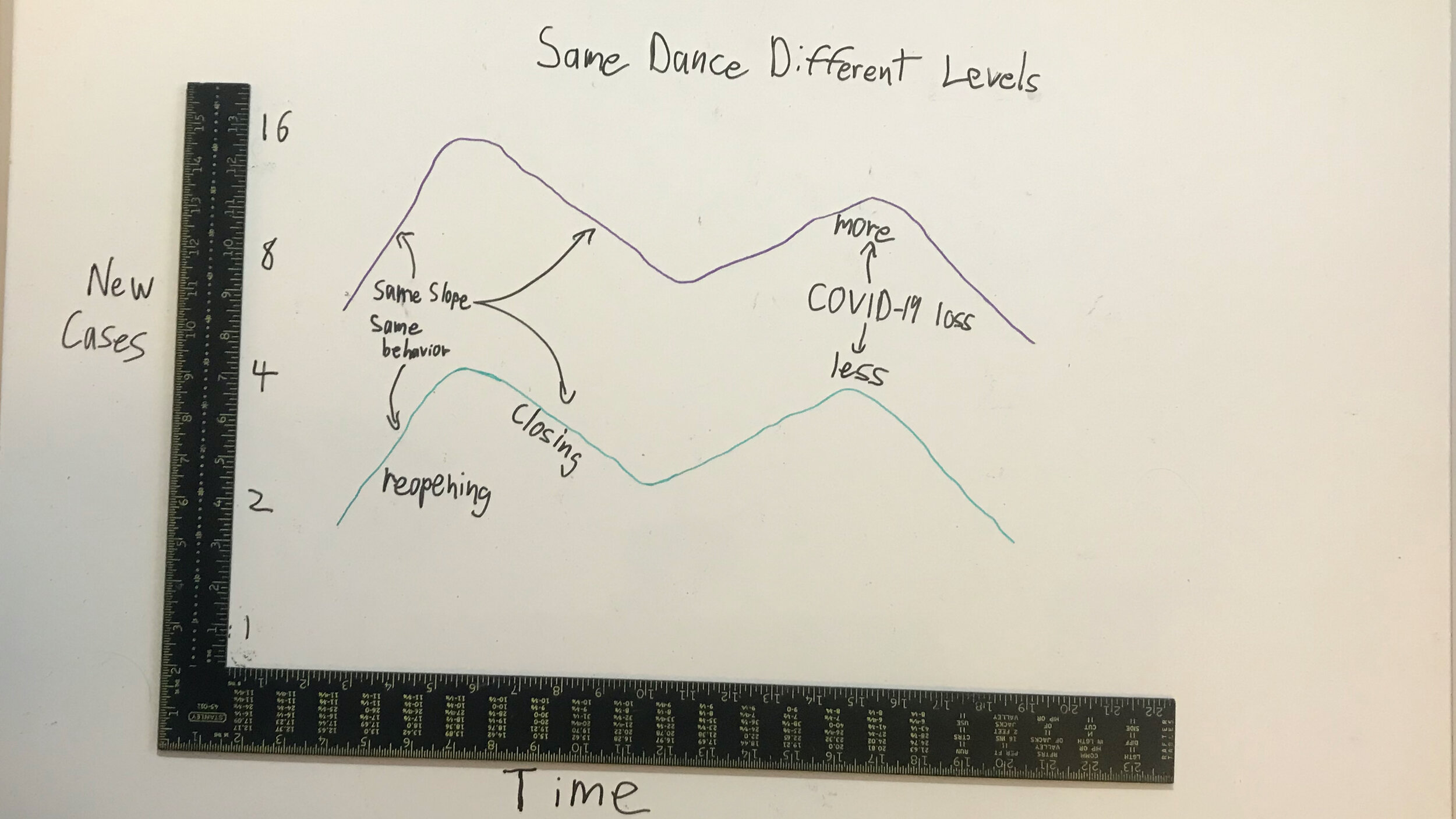
If you are unfamiliar with logarithmic plots there is a post below in the data literacy section that will help you read and interpret the interactive animated plot.
Data Literacy: Be a careful consumer of data.
In the posts below we discuss how to know whether the data you’re looking at is good and been interpreted well. All the links below are posts. Please click on a post to see details.