Logarithmic vs Linear Plots
Anytime that you see the growth of the virus plotted over time it should be done on a logarithmic chart. If a journalistic source is putting this increase on a linear plot it is only to show you the power of exponential growth but they won’t be conveying much useful information.
Scientists have long known of humans exponential versus linear bias and the visual tool they use to get around this problem is called a logarithmic plot. A logarithmic chart turns exponential curves into straight lines so that we humans can relate to them and clearly discern the story that the data is telling us.
A logarithmic plot is one in which every vertical interval increases by a power of 10. So while the y axis of a standard plot increments like so 0, 1, 2, 3, 4 … the y axis of a logarithmic chart increments 1, 10, 100, 1000, 10000. To keep from writing many extra zeros scientists might sometimes use scientific / exponential notation in which the exponent indicates the number of trailing zeros. In this notation 100 represents 1, 101 represents 10, 102 represents 100, and so on.
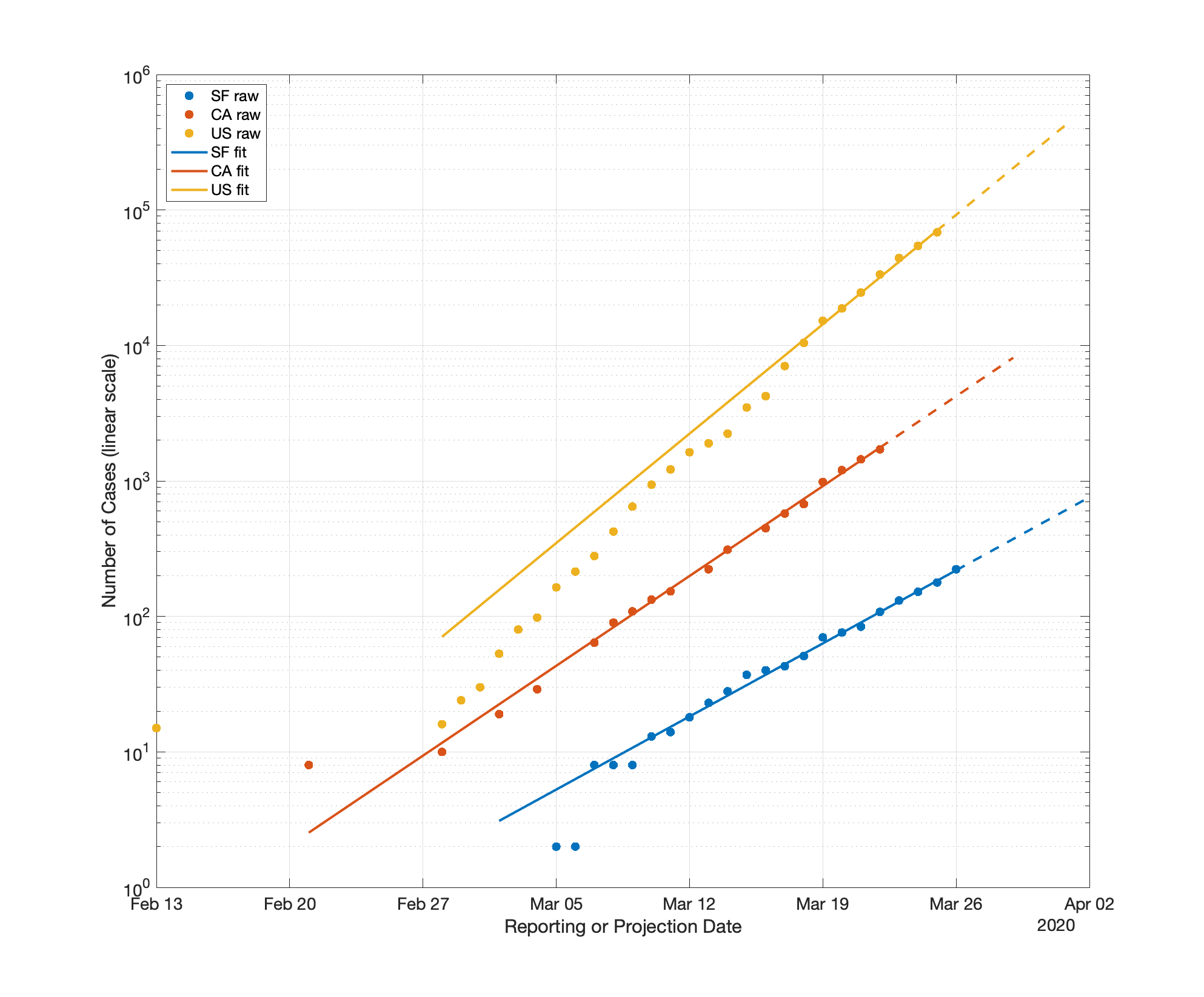
There are two plots below in which I graph the same numbers, case counts for COVID-19 over time for San Francisco, California, and the United States. The top plot is done on a logarithmic axis the lower ones are done on linear axes. I also fit those numbers and project that fitted line forward. First note that I can’t even display all three lines in any single linear plot but I can show them all in the single logarithmic plot and I can compare their growth rates in that single logarithmic plot. On the linear plots the case counts are either so far below or shoot so far above that I cannot make any meaningful comparisons between the curves. Also note that in the logarithmic plot we can see that the San Francisco and California case numbers have been remarkably consistent. The US case numbers exploded up until about March 11th and then the growth slowed a bit. The US case numbers are still growing faster than either California or San Francisco.