How Close Did We Get to a Meltdown (in Round 1)? 6 Days.
Looking around, it seems that many of us are getting tired of social distancing. And it also seems that with all the talk of re-opening, there is a palpable sense that the worst is over. These notions are understandable, although pretty risky, but what is less understandable are the voices that say “we were never really in any serious danger”, or that “it was a hoax”, or something equally dismissive.
So let’s try to answer that question “Were we ever really in serious danger?”
There are several ways we could define “serious danger” that most people could probably agree upon:
more people dying than a normal flu,
health care providers put at mortal risk due to lack of PPE or other resources
running out of ICU beds for dangerously infected patients (as we learned from Italy, dangerously ill patients without medical resources are very likely to die.)
Of the the three of these, the flu question is a trivial YES, THIS IS MUCH WORSE*, the second one is difficult to answer without data I don’t have, but what about the third one: ICU beds? Do we have data there that gives us good insight?
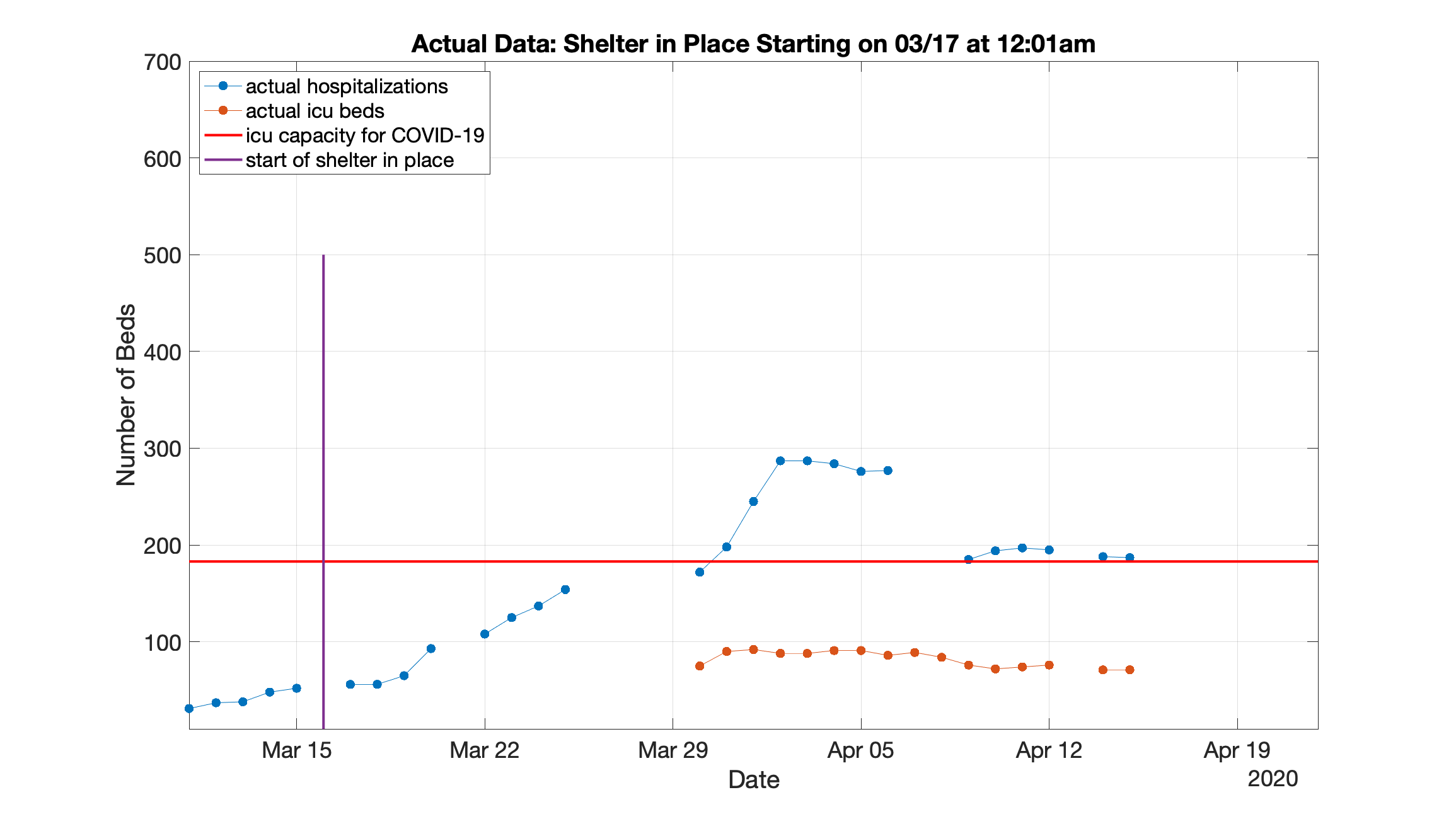
It turns out we do - because Santa Clara county has been reporting both their number of hospitalizations and their “Available ICU Bed” capacity for much of this initial phase of our fight with COVID-19.
Since we know how many hospitalizations for COVID 19 occurred in Santa Clara, and we know how many of those hospitalizations were dangerous enough to require an ICU bed, we can simply extrapolate how many ICU beds would be required if the number of cases went up higher.
That is to say we can estimate how many ICU beds would have been needed if the “shelter in place” order happened 1 day later, 2 days later, 3 days later etc.
This is illustrated in the video below (and I’ve included the first graph & the last graph at the end of this post to look at in more detail):
Note a few things before you dive into the video:
The purple vertical line is the date “shelter in place” starts - it really started on March 17th, so we advance it 1 day at a time after that.
The solid blue dots on the left represent actual hospitalizations in Santa Clara County
The lighter blue dots represent new hospitalizations that we estimate would occur given how fast new hospitalizations were occurring without “shelter in place”
The orange dots represent ICU beds needed
The red line is how many ICU beds are available - if we cross this line, we have mortally ill patients who don’t have an ICU to take care of them.

Thus, this shows that that if we started the “shelter in place” 6 days later, and the rate of hospitalizations stayed the same, we would have run out of ICU beds in Santa Clara by April 6th.
Since we have every reason to believe that the rate of infections and hospitalizations would have stayed the same without some drastic action (“shelter in place”), we can reasonably expect that this graph provides a good approximation of what would have happened.
This is just the data for Santa Clara county of course, but it makes the point that most likely all of the Bay Area counties were on a trajectory to exceed their ICU capacity. And that would have meant a lot more death than we have already faced.
We were really close. Thank You Bay Area Governments!
The good news is, of course, that we took strong action early & it paid off.
The less good news is that this was only Round 1. So let’s keep that in mind: with no cure and no vaccine, this is still a very serious fight, so please keep acting like it.